Friday, February 26, 2021

Fun with Noise Reduction

At the end of 2014, I was working with some 4K footage from the early days, and it didn’t have enough light — shot indoors. The 4K detail was in there, deep down ... if you could remove the temporal noise and not the spatial noise.

Fast-forward to the end of 2019, and I had a 6K 360° edit that was so information-dense, it needed to upscale to 8K for delivery: I could find no way to create a 6K MP4 the same or smaller size than an 8K MP4 with the same PQ. However, I left a large opportunity for datarate savings on the table — I didn’t have time to find a perceptually transparent temporal noise filter.

As we move into an era of reliance on upscaling and ML reconstruction, we need to preserve a lot of the "noise" texture that was in the lower resolution formats. It’s the same gotcha we had when moving from perfect analogue -> typical digital.

I’ve been meaning to write this up for 6 years.

Jumping straight to the conclusions, here's what I learned:

  • HQDN3D has easy settings but is probably never going to be as useful as NLMeans.

  • NLMeans luma (y-settings) will always alter the feel.  This is why the ‘Grain’ presets are all zero:
    Even a super-low strength of 1 or 2 will remove detail.  Trust the HandBrake presets.

  • NLMeans’s prefilter mean,median will give bitrate reduction of 2%,1% each, PQ neutral.
    They will also increase processing overhead by orders of magnitude.

  • NLMeans’s Grain (Strong) preset will give bitrate reduction of 9%, PQ neutral.

  • x265’s Grain tuning will give bitrate reduction of 40%, PQ neutral.
    RF 18 on None Tuning can preserve as much detail as RF 28 on Grain Tuning.

  • x265 knows how to NR — don't overlook your friendly neighbourhood encoder!
    When experimenting with NR filters, you can find better results, or quicker results, or both.

  • x265’s best quality 🀯 comes with ‘Slow’.  ‘Slower’ and ‘Very Slow’ are 6%-8% larger files.
    x264’s best quality 😏 comes with ‘Very Slow’, not ‘Placebo’.  The clue is in the name.
    Trust the Handbrake presets.

  • RF28 to RF18 are as far as you want to go.  Target bitrates only if you’re forced to.
    Trust the Handbrake advice.


Extreme Noise Reduction:  fixing a bad mess


Here is the 2014 project, with NLMeans settings at — 10 : 0.15 : 9 : 3 : 30 : 0 — that's a sextuple:


You can see some “fly noise” large black dots — this frame in particular.  This is enhanced noise because the shot is a 2K crop out of the 4K video.  NLMeans removed most but not all the dots.  One of the parameters made most of the difference, but I forgot which one by 2015.


I had also used 10 : 1 : 7 : 3 : 30 : 0 for a while but it did not clean up the large noise in the close-up as effectively.  The origin-tune and patch-size were the two settings that made the difference.


3DNR too far:  not for studio quality sources

Flash forward to 2021 and I am converting some S-VHS tapes to 1080p and even HDR.  The breakthroughs have come in good consumer-grade sampling and upsamping, but the industry’s fascination with temporal noise reduction may have come in a decade where LCDs have lowered our expectations in temporal resolution:  I was able to turn off my JVC’s DigiPure 3DNR once I found the menu in S-Video, but the Ocean Matrix S-Video to HDMI upscaler has no settings at all.

I’ve since replaced it with a more configurable Magewell (despite it not always locking on to field dominance) and here's why:

Ocean Matrix, as recommended by @techconnectify … probably fine for 24fps content?

Friday, August 5, 2016

Presenting the Olympic Flame in 4K 60fps … from 2012

Every four years the Sydney Olympic Cauldron lights up again in a lovely sympathetic gesture to its newest sibling somewhere else in the world.  I had just bought a 4K camera and the day I chose to go down to the Olympic Park, everything went right in terms of photographic composition.

Then I spent the next 4 years editing it, on and off — here's why:
Yes that's right, 6 terabytes of work space for 2 hours of footage
This was the effect of running a spot of motion compensation on some clips.  The camera I got in 2012 — without spending more than one fortune — was only able to record 1080p60 onto four separate SD cards that each took a quarter of the image.  The HDMI standards didn't exist yet so it also has four mini-HDMI outputs for the same purpose.

The other labour-of-love pain was that the nature of 4K was so "good" that anything bad was magnified so much.  No imperfections could pass, and they were more visible than ever.  To give you an idea, even with a tripod, not only could I clearly detect every single time I pressed a button, but the wobble would resonate for another 10 seconds until it finally, relentingly, dissipated.

This made for a lot of tedious frame-by-frame sifting and culling.  Never has so much "good enough" footage been left on the cutting room floor.  Two hours of filming came down to 39 minutes of "good enough for 4K".  I'll post that next on Vimeo next week.

Speaking of Vimeo — it is back as my favourite.  Unlike YouTube, since December they've been able to display not only 4K at 60fps, but also make the performance hit the full frame rate on a mid-level machine in a browser!  So, please enjoy …

[4K60] Sydney Olympic Flame on Vimeo.

A tribute to the flame: Every 4 years the Sydney cauldron is re-lit during games time in another country.

3840x2160 60fps

JVC HMQ-10 and Final Cut Pro X

Tuesday, July 26, 2016

And now for some SDTV fun …

On the verge of finishing my greatest ever 4K video art, I've begun to explore the other end of the video world — the Apple II's NTSC artefact colours.

First up, the 6-colour mode that debuted (with a tweak) in the 1977 Apple II (original model) — it can actually do ten colours:

… depending how you feel about dithering lines that aren't interlaced to begin with?  (credit:  Beagle Brothers)

Remember this is on a 192-line frame contained on a 240p display fed to a 480i TV.  But it does make the moon in Choplifter™ go from stripey-colours to grey.  It's the moon so it must be true.

Next question:  What do you call those colours?  Not-quite-yellow, not-even-cyan, crazy-violet and are-you-even-blue?

Well, if you've been paying attention, you might recognise these as your weird friends in those other colours who didn't fit in the normal colour bars, from the test pattern as seen in Europe and Australia:

"PM5544", so much better than those SMPTE bars.  Yes, this is one of the NTSC versions.  (credit: William Brown)

And what do those sections of the almighty test pattern denote?

1 + 5 = chroma 180ΒΊ which is 75% yellow, 25% green
1 + 6 = chroma 270ΒΊ which is 75% cyan, 25% green
2 + 5 = chroma 90ΒΊ which is 75% red, 25% magenta
2 + 6 = chroma 0ΒΊ which is 75% blue, 25% magenta

If only the many t-shirts that ripped off PM5544 had checked with this first.  No, not NTSC:  horizontal acuity is too high.

In fact it's worth pointing out here what the HGR colours really are:
1 = chroma 225ΒΊ green
2 = chroma 45ΒΊ magenta ("Violet")
5 = chroma 135ΒΊ which is 50% red, 50% yellow ("Orange")
6 = chroma 315ΒΊ which is 50% blue, 50% cyan ("Blue")

credit:  gvworks.blogspot.com

In the revision A motherboard of June 1977, the Apple II only showed green and magenta (plus black and white), with two bits per (colour) pixel in high-res graphics (colour mode).  A third invisible bit per (colour) pixel was soon added that shifted the colour phase 90ΒΊ — this then formed the basis of the colour graphics for the largest collection of games and software until MS-DOS.  That's why the two "new" colours don't have a proper name but you can see why they make logical sense if you want a balance;  you can create any other hue via dithering, and Apple II graphics don't show a tint bias.

Second up — the more complex, far less supported 16-colour mode introduced in 1983:  still the same number of (colour) pixels, but now with 4 sub-pixels instead of 2, thanks to the 80-column mode doubling the resolution.  That's a proper 4 bits per pixel, rendered straight onto the NTSC signal like CGA composite*, no phase bits.  If you subtract black, white and the two new greys, that's 12 colours, or 8 new colours.

That's probably just a complete coincidence … right?

As you can see, text on colour backgrounds is a challenge.  Coloured text on coloured backgrounds even more so.  The situation on Apple II is generally:
  • Normal high-res (HGR) gets you 40 columns of black & white text
  • Double high-res (DHGR) gets you 80 columns of black & white text
So perhaps double high-res could accommodate colour text in just 40 columns?  The Beagle Brothers toolkit only supported that in 20 columns though, because the (colour) pixels are still as wide, there are still 144 total per line.  Nevertheless πŸ€” there are now 4 sub-pixels to play with … ?

The text generally used on Apple II is only 1-pixel thick.  If you lay 40 columns onto the DHGR mode, they're now 2 pixels thick.  But you need 4, most of the time …

Interestingly, the Apple IIgs had already faced this problem in its Shaston system font.  Back in 1987 they had to make a system font that was generally 2 pixels thick — and this is in 640 mode (the equivalent of 80-column mode, but in an entirely new graphics system).  They had to make it 2 pixels thick because the only way to create the colour grey was black-white dithering (like a B&W Macintosh), and they needed grey for the menus (like a Macintosh):

credit: http://www.whatisthe2gs.apple2.org.za/
But that's not all that makes Shaston interesting:
  • It still had to be legible when the dithering was active — each dot in the ellipsis "…" is visible
  • It still had to look good in 320 mode, at double the width
  • It still had to be small enough to work on half-SDTV 240p video
  • Unlike the rest of computing in the mid-'80s, this font didn't suck
So we have a font that will guarantee 2 pixels width everywhere on 40-column DHGR, but try its very best to give 4 pixels at all the important times — albeit a bit offset, so the colour starts in the middle of its "colour pixel" but continues into the next.

I threw a bunch of pixels at the next-best thing to a real NTSC monitor and this is what I got:


Surprisingly, far more legible than expected.  On the left half, a lot of the "Shaston pixels" line up exactly with the DHGR colour pixels, so you get a bunch of blocking.  The two sets of "ABC012" are aligned differently because each letter is 14 pixels, and doesn't fit neatly in a 4-pixel cell, so repeating the same string on an odd or even character will create a different result.  This is necessary if you're going to fit 40 characters into 144 colour pixels, though.

On the right, I pushed everything to the right by a pixel.  In theory, this should always be worse, because you won't have a single colour occupying each "colour pixel" block very often.  (In reality, there is always a single colour occupying it … but it will be neither the foreground or background colour you chose).  In practice though, it looks far more promising.

The bottom half was an experiment in adding an extra 1-pixel edge to any rounding on the shapes, e.g. the top of the "A" is round.  To the real Shaston font, this is only a half pixel in its universe.  I gave up on this as it seemed okay in lesser emulators but didn't produce superior results here.


After trying a few more colour combinations, what's more interesting now is that the non-offset versions sometimes win.  It looks blurrier but always preferable, very much like any other antialiasing on graphics systems 20 years hence.

One goal isn't to generate every single colour combination, but only the RGB+CMY+B&W combinations found in teletext and videotex.  This was a 40x24 (actually 39x23) system that was used in European televisions and dial-up terminals in the 1980s to create a kind of socialist-paradise internet prototype.  A very colourful one at that, so naturally it has a cult following, and an app for Apple TV 4 to let you see what is broadcast by most of the TV stations in Europe that still use it.

DHGR's "pink" on "dark blue" is far more legible than the colour generally called "red" (I suspect it is 90ΒΊ chroma).  DHGR's "dark blue" seems a lot closer to the pure "B" in RGB's colour bars anyway, and it certainly works better on a yellow background for legibility.  There are three greens and three blues to work with, so I will experiment to see if a substitution table can make all RGB+CMY+B&W combinations legible, without making it too obvious that they are changing.

There might even be a mathematical model to derive instead of a look-up table.  I'm certainly hoping so when it comes to the selection of offset = 0 or 1 for any given foreground and background.

* for some really good reading on CGA composite tricks — and a lot more NTSC theory — go see the amazing 8088mph blog:  http://8088mph.blogspot.com.au/2015/04/cga-in-1024-colors-new-mode-illustrated.html

Wednesday, March 25, 2015

4K60 on YouTube gets you a maximum 1080p60 … for now.

So … it seems uploading 4K60 content gets you a 1080p60 stream but not a 4K30 stream, let alone a 4K60 stream.

Unless a week is not long enough to wait for processing 100mins @ 90GB?  It took 72 hours to spit out the 1080p60 version.


I read (I forget where;  so "here" is good enough) that YouTube's current limit is 200GB.

Ten years ago their first limit was 100MB which, even for the MPEG-4 Part 2 video of the day, was very limiting.  Remember that their duration limit didn't come in for some time until the commercial world discovered rampant piracy was YouTube's "killer app".  (Orthodoxy says it was the Share button and Embed feature).

I foolishly didn't enrol in their "director's account" system before the Google buyout, so ignored YouTube for most of its 10-minute / 15-minute limit era.  Otherwise I could have used some ancient H.264 kung-fu to really squeeze something useful out of that 100MB.

Instead I jumped on the Google Video bandwagon — not the search, but the upload tool.  Yes, that did exist as a YouTube competitor.  I liked it for its 60fps support.

Here's a 480p60 video from Google Video that made the "migration" to YouTube, losing half its frames:

True, YouTube had 240p60 in the beginning, but since I was dying for 576p50 it never occurred to me to test it out.  I was probably too bitter by the 1990s experience of watching American TV via diplexed analogue satellite feeds that linked two NTSC feeds in 240p30 format, worsened by the early-generation electronic standards converters with one-field frame buffers (and no motion interpolation) that made every horizontal edge move with a continuous slow wobble.


And the first-generation studio CCD cameras, which even in NTSC land had no oversampling:

The eyes!  The eyes!  Where are the whites of their eyes!
Anyway.  Let's celebrate YouTube bringing the internet into the 1930s with full motion video since November 2014!

Thursday, March 15, 2012

1080p, iTunes and sandblasting perfection

WARNING: Windows users may need to adjust gamma up by 50% for these images ...

This week has to be one of the best moments to warm a pixelnazi's heart ... not because of the new big Retina displays, or the launch of 1080p iTunes and AppleTV, but because of the rare surge of pixel gazing happening around the internet.

You may have heard of the ArsTechnica "smackdown" article already:

iTunes left, BluRay right — the perennial red-to-black sensitivity curve strikes again:
in the left image, see the early quantization in the top-right edges of the red circle
But soon after, MacObserver posted a followup, not to dispute that BluRay was better, but taking issue with ArsTechnica's assertion that the difference was marginal and not very noticeable:


In this case, the saturation is noticeably different, and this immediately makes the comparison less accurate in terms of human perception as well as for technical reasons — a pure codec+parameter comparison becomes invalid, as any codec will take different priorities at different parts of the colourspace. Indeed, a saturation shift would also ring alarm bells in terms of the entire colourspace changing, so be wary of irregularities in the hue, brightness and the entire transfer function as well.

One thing we should mention now is that articles like these are going to be very tricky to judge on Windows computers. The second image comparison on the MacObserver article looks totally black:

This will be even more crazy-dark if you're reading this on Windows

ArsTechnica has another good article on what is arguably the more important MPEG upgrade in the new AppleTV, and the other iOS devices in their latest generation:


In the same way that MPEG-2 digital TV decoders are classified as "MP@ML" Main Profile at Main Level for standard definition and "MP@HL" Main Profile at High Level for high definition, there is a step up in capability as the MPEG-4 decoders move from 720p to 1080p standards in the iOS devices.

Compare "MP" Main Profile with "HiP" High Profile (courtesy Wikipedia)
So the new devices support 8×8 transforms, quantization scaling matrices, and separate Cb and Cr QP control. While the iPhone 4S and iPad 3rd gen support "HiP@4.1L", the 1080p AppleTV only supports "HiP@4.0L" — this means a 25Mbps limit on the bitstream you can feed an AppleTV, but a theoretical 62.5Mbps limit to the iPhone 4S and new^3 iPad.

With the whole universe now 1080p compatible, we'll move on to bigger things next time.

UPDATE: Some more microscopic pixel gazing here:

Tuesday, February 7, 2012

The nexus between upscaling and decompression

Now that everybody has a Full HD display, you’ve probably formed your own opinions on the quality of SDTV content.  In the early days, it was a bit of novelty to have your own broadcast-monitor experience, like being able to judge whether a news studio had upgraded to a digital tape format yet.

But SDTV will be with us for a long time;  quite apart from the diversion that YouTube, cellphones and the scene have taken us on — something of a long-run historical blip — it’s inevitable that the standard “standard” still has another 20 years left in it.  A large body of work is still being created in this format, so it’s not about to lose its replay value the way black & white did in the ’80s.

So we’ll be dealing with non-square pixels for some time to come.  But I digress.

More than you might realise, our experience (and opinion) of SDTV is influenced hugely by the scaling process.  The quality of the upscaling has often left a lot to be desired, even by broadcasters:  All but one of the five national networks in Australia used only field-based rendering until 2007 … this meant that each field (1080i) or frame (720p) of HDTV broadcast had only the detail of 288 lines, or “288p”, half the SDTV potential 576 lines in a static image.

The tell-tale signs of field-based scaling
For several years, it was more likely that a $500 decoder box with HD outputs could do a better job than the networks.  And by 2005, the last generation of 1376x768 “non-full” HDTVs could finally scale 480i or 576i properly, deriving the full detail from a static SD image.  Full HD panels soon became a baseline feature, and the momentum was such that in 2006, it became de rigeur for HDTV displays to take a 1080i signal and derive a real 1080p picture with a static image.  When you think about it, this was quite an achievement, with 3 gigabits per second being processed by the internal chipsets.

24 bit colour × 1920 × 1080 × 60fps == 2,985,984,000 bps
double again for "100Hz" / "120Hz" interpolation

But by 2010, after a lot of network upgrades, the situation finally turned.  The networks were finally creating a nice image on their HD channels from their studio-quality SD sources (as the layman had always presumed);  now the only thing unnecessarily limiting quality on all those Full HD displays was the SD channels — or, to be accurate, the way that SD was handled.

A few things have helped mislead viewers into believing that everything on the HD channels was “in HD”, or HD-native, because the end-product of the SD channels was very far from SDTV best practice.  One thing was “small” screen sizes — anything under 60 inches makes it hard for an untrained eye to tell the providence of an HD end-product.  Another thing not helping matters was that the SD channels were more aggressively starved of bitrate;  yes that’s a factor, but a more important one has been the state of the art of consumer-side scaling.

So, what's “best practice” with SDTV, even if you can find channels with DVD-like bitrates?

True, field-based processing has long been history, but when you’re done deinterlacing at very high quality and are faced with a 720x480p60 or 720x576p50 sequence that requires display on a panel that has anything but those pixel dimensions, there are many ways to skin a cat.  As people soon found, an “upscaling DVD player” with HDMI output often did a much better job at exactly the same thing that the TV itself was supposed to do.  The SDTV channels as viewed on TiVo, Sky+HD, IQ2 looked better than the TV’s own tuner, or indeed other decoder boxes.

Both are examples of 576i upscaled to 1080i.  Both are deriving frames via 576p.
On the left, TiVo.  On the right, ‘another’ chipset, not utilising Faroudja technology :-)
The example on the left is definitely what you want to live with day-to-day, unless you're lucky enough to live in Japan.  You will have a very pleasant viewing experience on your Full HD panel if you apply this to studio-grade SD, and to SD sources derived from HD material — this is getting very common as cameras get upgraded more quickly than delivery mechanisms.

But we’re still left with a real-life problem:  What about the macroblocks?  In broadcast material, you’re often lucky to get as high as 720x480 or 720x576;  in streaming technologies, the problem is even more common.  You’re most likely to see this unavoidable drop in resolution on broadcast during a “quiet” scene if all hell is breaking loose on the other channels of the same transponder, and the broadcaster has an aggressive statmux’ing regime that rips the megabits out of the channel you’re watching:  The i-frames will become very visible and blocky, at the start of every MPEG GOP as the video starts “pulsating” with every group, generally once per second.

Here is one example of just such an occurrence, with the anamorphic 720x576 image @ 100% on the left.  On the right, I've converted the image to 90x72, and blown it up to view @ 800%.
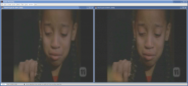
Spot the difference  :-(
So, yes, for one frame we are watching the equivalent of a 72x72 postage-stamp sized video.
Hello, 1991 called — they want their QuickTime v1.0 video back.

Of course, with twenty years’ strides in technology, we should be able to do a better job than this.
The decoder should be signalling an alert to that fancy 1080i scaler connected to the HDMI port.
Or, at least, if we’re not going to interfere with the 1920x1080 frame buffer, let’s at least do what we can with the 720x576 frame buffer — presumably we still have to manufacture not-very-integrated chipsets that have to process video sequentially in intermediate frame buffers like this?

Left:  Bilinear upscaling.  Right:  Bicubic upscaling.
The challenge here — the only challenge — is to identify how low to go before applying a sane upscale, not some ridiculous nearest-neighbour copyblt lazy engineering.  Of course, this information is already available during the MPEG decoding process, and, of course, it’s only really needed during the lightweight MPEG-2 and SDTV decoding that’s long been conquered — but shall be with us for decades yet.  (In heavier scenarios, with MPEG-4 AVC deblocking and/or HDTV frames, this technique isn’t necessary).
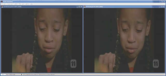
Left:  Different frame, far less severe bitrate starvation.  Right:  Yet another frame, with ‘normal’ bitrate.
(note the quality recovery comes largely as a result of p-frames coping a lot better under harsh conditions)
Compare it to some more “normal” frames, above, to see how successful it is to integrate scaling and decompression stages.

By the way, the video sample here has been through a fairly typical process for older American TV shows in PAL/DVB countries:

film 24fps  480i 23.976pSF  576i 25pSF  540x576  padded to 720x576 for 16:9

And following on that, you can get all the 1080i scaling mentioned further above.

Sunday, January 29, 2012

Squeezing the most out of H.264 QuickTime


Presumably you already know about keeping the native resolution, aspect ratio,
frame rate, interlacing, etc., taking into account the final delivery format.

At this point it's worth repeating that Vimeo allows "Plus" users to download
each other's raw upload file ("raw" as in what got uploaded to the site). This can
be any .MOV or .MP4 you wish, getting around the 30fps limits of "online video".

How to get the most quality out of your QuickTime encoding:
   
  • Most importantly, install an x264 implementation encoder.
    It still decodes with Apple / VLC / MPlayer / etc.

    http://www.macupdate.com/app/mac/20273/x264-quicktime-codec

    This is Henry Mason's x264 implementation.  After extensive trial and error,
    I've found it more effective than the 'lavc' implementation, with far fewer buttons.

    Here's what I mean:
The 'lavc' x264 options panel.  Thankfully, we can avoid this.


  • Advanced Settings:

    This is simply a question of DB or not DB.  Deblocking is the pre-filtering
    craze that makes people with a semi-trained eye believe they have conquered
    the MPEG quality issue.  "No More Blocky Pixelization!"

    Unfortunately, it's also a killer of HD.  With time, you'll come to appreciate
    that deblocking kills the "oversampled" pixels which make the best HD film
    transfers, or classy 4K to HD content.  Indeed it can take away the full
    potential of SDTV (the best SD is always produced in HD).

    If you come across a high bitrate MPEG-2 source, you'll notice the lovely detail
    in the noise which really isn't noise at all.

    If your video feature contains grains, rocks, forests, or textures of any kind,
    then turn off DB.
      This is the key to ensuring that the feel of the video does not
    change … it is the only setting that has a real impact on changing the nature of
    the picture.  This sets it apart from the amateurish look of archive-unfriendly
    codecs like Cinepak, DiVX and Xvid, historically abused by "the scene".
    x264 Advanced Settings:  No DB
    Turn on CABAC (the real grunt behind H.264) and everything else, except B-frame
    Pyramids:  All the others put a burden on the
     encoder (you) and not the decoder;
    the random forward-lookup nature of the B-frame pyramids 
    means you would be
    placing an undue burden on the viewer, whose Pentium III 
    clunky laptop probably
    can't cope with the decoding.


    If your video feature contains mostly glossy surfaces
    blue sky, cloud or water,
    then use DB.  Set it to maximum.
     These are examples of where DCT technologies
    come up short;  the MPEG family will try to be "faithful" to the noise but in our minds
    we want to see the smoothness of these surfaces.
    x264 Advanced Settings:  DB Max
      
  • Aiming for a bitrate?  Use 2-pass and turn off the frame resampling.
    Of course, if you're aiming for a bitrate, you'd use "Restrict to" and enter kbps!

    There's a big fat bug:  If you don't select "Current", the 2-pass encoding won't hit
    your target;  instead it will just give you a "medium" quality encoding, regardless of
    the target bit rate, spatial quality percentage and temporal quality percentage.
     
  • Generally, though, you're not aiming for a bitrate.  You would be:

    1.  Uploading a short YouTube feature that doesn't go near the 20GB "pro" limit
    2.  Uploading a very short Vimeo feature that doesn't go near their 5GB limit
    3.  Uploading a low-resolution or sub-15-min YouTube clip;  you're going to be
         nowhere near the 2GB "amateur" limit, just wanting a quicker upload than
         you'd get if you uploaded the original source — without losing too much quality

    In this case you should set the Data Rate to Automatic, and select one of the following
    for Spatial Quality (temporal quality is ignored):
     
    • 50% Medium for "looks good to most people"
      (equivalent to bit-starved broadcast quality)
    • Halfway between 50% Medium and 75% High "looks good to pros"
      (equivalent to a typical DVD or BluRay)
    • 75% High only if you really need to maintain existing artefacts
      (e.g. for another generation of editing)
    • Halfway between 25% Low and 50% Medium for just scraping by
      (e.g. if you had a really bad source anyway,
      and just need some further bitrate reduction)